
Branding 101 Part 2: How to rebrand successfully
We live in a world where everything is constantly changing.
Even we, as individuals, change so much over the course of our lives –– you don’t wear the same clothes or listen to the same music for your whole life, right? And in the same way, a brand shouldn’t stay the exact same for its whole lifespan either.
Rebranding is an excellent way to breathe life and energy into your company, to keep up with modern trends, and to set yourself apart from your competitors.
Whether you’re a one-person powerhouse or a huge global corporation, branding is the most important element of your business — we covered the reasons why in our first post, ‘Branding 101’.
And once you have a set brand that you’ve committed to, it can be hard to switch things up. But rebranding can sometimes be exactly what your company needs.
Why change your brand? 4 business-boosting benefits of rebranding
A lot of the time, rebranding isn't so much about completely overhauling the image you’ve already built. Instead, it's about making small, thought-out, incremental changes to your existing brand to better suit the current marketplace, what customers are looking for, or what competitors are doing.
You want to stand out and make an impact while providing something your competitors aren’t. So here’s what a successful rebrand can do:
Rebranding helps engage a new audience
Giving your brand a revamp, and switching up your look, can really make you stand out to new audiences.
As humans, we’re instinctively drawn to things we identify with. So undergoing a brand refresh, with your specific demographic in mind, can go a long way to resonate with your audience. You might not be changing the core product or service that you offer, but you’re communicating it to the outside world in a slightly different way.
A rebrand can build up a competitive advantage
Sometimes, what once was unique in the market ends up being commonplace. Ever noticed how most new lifestyle brands follow the same sans-serif, pastel color design style? Someone had to have started that trend!
When this happens to you — which, at some point, it probably will — a rebranding project can help build back in competitive differentiation and advantage.
Rebranding keeps you current
Online trends move incredibly fast. What’s cool one month might be passé the next, and how trends are used in design plays a major role in how (potential) customers perceive your company.
If your look and feel is a little more 2015 than 2021, a rebrand might be the answer. Not sure how contemporary your visual brand language is? Book in a free consultation with us and we’ll let you know.
You can rebrand to introduce new products
Just as trends move on, so too do customer needs. That’s why your products and services have changed over time as well.
But how well does your current branding showcase your current offering? If you’ve updated your products, but not your brand, chances are you’ve got a mismatch. Head back to the drawing board and explore the customer benefit of buying from your business today, then reflect that in your visual communication.
How to approach rebrands, big and small
There are a lot of things to factor in when considering a rebrand.
Rebrands can be huge projects, where you essentially chuck out most of your current visual brand language (and your name, sometimes!) and start again. They can also be as "simple" as refining your logo to fit with modern trends.
Here are some questions to ask yourself before rebranding:
What is your mission, vision, and values?
As part of your brand strategy, you should have a clear idea of your mission, values, and vision for the future. Does your branding reflect your goals?
If yes, you’ve got the right foundation. If no, a more comprehensive rebrand might be required.
Who are your customers and competition today?
Think about your customers and your competition back when you first designed your brand –– are they the same or have they evolved over the years? If they’re different, then your brand should be different too. Identify what your customers want and need from your business, and then analyze how well your competitors are doing at delivering on that.
Insider tip: when thinking about your current audience and what resonates with them, it’s important to be very wary of ‘flash in the pan’ trends. You don’t want to overhaul your entire brand to suit an aesthetic that’ll be outdated in a year or two.
How memorable is your name?
Memorability is important in branding, and in 2021 that also means having a brand name that's easy to Google.
If your brand name is hard to spell, or is too close to another company name — especially one that's bigger than you! — then you might want to reconsider your choice.
Who can provide an honest vibe check?
Second, third, and fourth opinions are always helpful. You may think you’ve come up with a stellar new brand identity, but you’re designing for a far wider audience than you alone!
Collaborate on your rebrand and get an outside opinion from friends or family, (if you trust them to be honest!), from a third-party supplier, like a graphic designer, or from your customers themselves. Even just a couple of Instagram Story polls about color, logos, and font can be a great way to determine what resonates with your followers.
Not to be dramatic, but if you don't test your rebrand before you release it to the market, you may live to regret it.
Famous rebrands: the good, the bad, and the... WTF?
There’s no shortage of great rebrand inspo from the world around us. Let’s take a look at some iconic rebrands — some good and some… not so good and why.
The good
Airbnb

Airbnb had one of the most successful rebrands in recent years, transforming from a messy, graffiti-style logo to a sleek and instantly-recognizable one.
They commissioned a new, bespoke color — known as ‘rausch’ — to add passion and warmth to the brand, and successfully became one of the biggest companies in the world.
Tupperware

Once an uninspiring brand associated with housewives of the past, Tupperware underwent a bold rebrand. Instead of trying to reinvent themselves, instead they leaned into their retro image but gave it a modern spin.
The bad
MyspacE

Myspace probably thought they were really onto something with this logo revamp.
Once one of the most popular social networks in the world, the company fell out of favor in the late ‘00s when Facebook came along. No doubt trying to keep up with modern trends, they rebranded their logo, but came up with something a bit too… clever? By omitting half the name from the logo, the company did little for itself by way of memorability either.
Tropicana

Tropicana cartons were some of the most instantly recognizable in the grocery store — colorful, large, and in a prime position in the family home. When they rebranded in 2009, their sales fell by 20%.
The goal was something fresh and uncomplicated, like their juice. But it was too far removed from the original design that customers didn’t recognize or resonate with it in stores. Oops!
The WTF
Seattle’s Best Coffee

This coffee company decided to bring its branding into the modern era with a sleek, flat logo. While they definitely nailed that vibe, they probably should have rethought the color scheme and the drop of ‘coffee’ which makes them look like they’re organizing a blood drive.
Hardly an appetizing or welcoming piece of comms for a coffee store! Today, a more vibrant use of red helps detract from the medical connotations of white and silver.
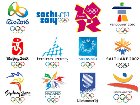
London 2012

When London hosted (and rebranded) the Olympic Games in 2012, everything went off without a hitch — except the logo.
What’s supposed to read ‘2012’ instead looks like a jumble of abstract shapes in bright colors. Olympic logos of the past have done a great job of capturing the host country’s spirit, but nothing about this says London nor Olympics. Abstract can be good, but here it just didn’t translate.
Inspired to do a rebrand, but don’t want to mis-step like Tropicana? We’re here to help you out.
Get in touch with Street Designed and together we’ll make sure your visual brand language says all the right things.