
Colour in Space
How palette influences mood, energy + emotional temperature.
Colour is not simply seen — it is felt. A room’s palette shapes nervous-system response long before furniture, texture or layout are registered. Light, pigment, and contrast influence whether a space energises us, quietens us, or subtly shifts emotional temperature throughout the day. In interior design, colour becomes both science and atmosphere — a tool for wellbeing, focus, restoration and creative expansion.
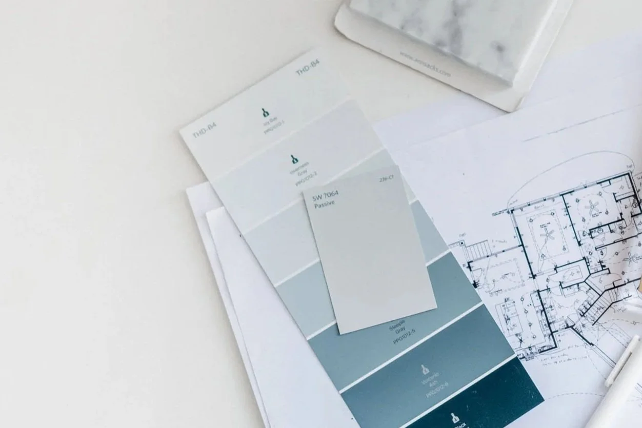
Understanding how colours interact is foundational to intentional design. Palette selection isn’t about trends or seasonal colour charts — it’s about emotional function. When we design with awareness, colour becomes a material in its own right. It carries tone.
This is where Design with Intent becomes essential — colour decisions made not for decoration, but for psychological effect, clarity and quality of life.
What colour theory gives us
Colour theory combines optics, art and human behaviour. It clarifies how hues relate — how they harmonise, contrast or unsettle — and it explains why some palettes soothe while others stimulate. Originating from Newton’s original colour wheel, the system remains one of the most reliable, evergreen frameworks in design.
We are not simply choosing paint — we are choosing the emotional temperature of a room.
The colour wheel — a map, not a rulebook
At its core, the wheel shows relationships:
Complementary colours amplify each other
Adjacent colours build softness and flow
Triads + split complements create dynamic balance
Cold hues (blues, sage, ash, lavender) slow the nervous system.
Warm hues (umber, terracotta, brass, marigold) enliven it.
Tints calm, tones ground, shades intensify.
Colour is language — subtle, powerful, deeply neurophysical.
Colour for restoration — spaces that exhale
Bedrooms, bathrooms, recovery corners — places where pace softens — benefit from palettes that lower internal volume.
Greens
Biophilic by nature. Associated with growth, forest stillness, renewal. Works beautifully in spaces intended for nervous-system recovery — from sage walls to moss textiles and olive cabinetry.
Whites, sky blues, soft greys
Cool tones create perceptual spaciousness. They open rooms, diffuse light, and steady the system. When used thoughtfully, they generate a quiet neutrality — a background for stillness.
Colour here is not absence — it is gentle infrastructure.
Colour for creativity, energy + cognitive lift
Studio spaces, workrooms and places where ideas need to move benefit from palette with brightness and pulse.
Yellows
Optimistic, activating, lightly electric. Even in small doses — trim, textiles, bindery — yellow increases alertness and cognitive ease. Sunshine for the mind.
Orange + warm coral
Confident, social, energising. Best used selectively — accent rather than envelope — where motivation or collaboration matters. Too much and it dominates; enough and it catalyses.
This is momentum by palette.
The modern interpretation — quiet saturation, human-first
Homes flex now. Work, rest, transition happen within the same square metres. Colour is no longer styling — it’s regulation. Emotional architecture. And palette often works best when supported by tactility. Fabrics for Living reinforces this — natural fibres, organic texture and long-wear textiles deepen calming colour rather than compete with it.
Homes flex now. Work, rest, transition happen in the same square metres. Colour is no longer styling — it's regulation. Emotional architecture. A palette becomes a form of self-direction: energise here, decompress there, breathe throughout.
When understood well, colour becomes a craft. And like any craft, it travels. It improves as our environments change and as we learn what shades make us feel most human. This is why design knowledge compounds — the more we notice, the better we choose.
Our relationship with colour expands through movement, challenge and exposure — the same way we refine creative capability when we work from anywhere, learning through new environments, cultures and sensory input. Palette evolves the same way.
Colour forms memory. It carries emotion. And if chosen slowly, it becomes architecture for the mind — quietly shaping how we live, work and feel.