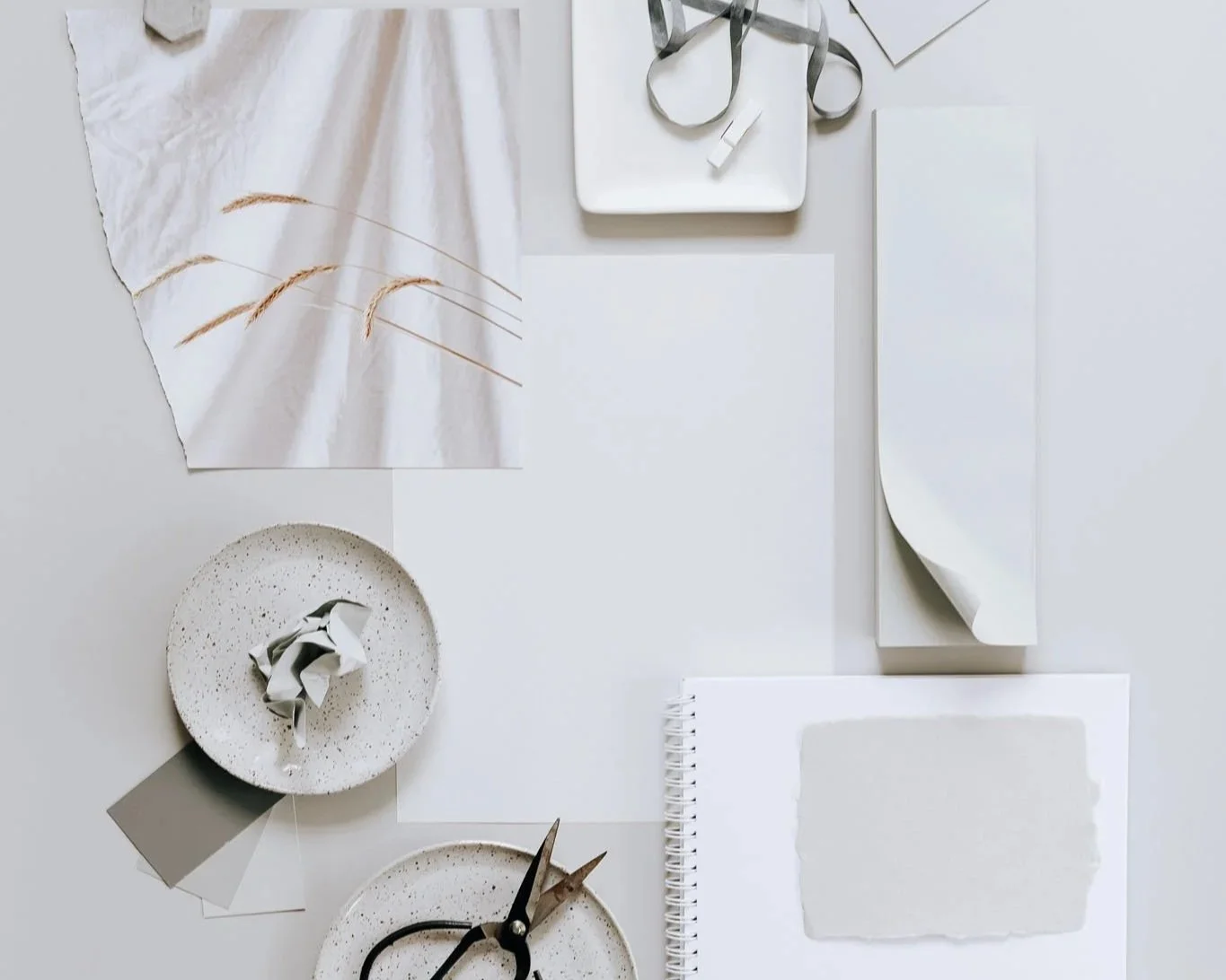
Packaging Design · Subtle to Statement
Seven creative executions that balance clarity and character.
Packaging is theatre in slow motion.
The reveal. The tactility. The pause between seeing and opening.
Done well, it doesn’t shout — it invites.
Done beautifully, it becomes memory.
Design lives at the intersection of clarity and character.
A subtle system can be more powerful than a loud one, and sometimes the quietest packaging becomes the piece people keep on their shelves long after the product is gone.
Packaging isn’t just branding applied to form — it’s identity translated into object.
Minimalism with feeling
Minimal isn’t empty — it’s intentional.
A single line. An understated serif. Neutral palette. Wide spacing.
When done with care, restraint feels like confidence.
You saw this foundation in Brand Identity, where tone precedes detail.
Minimal packaging works because it makes space for touch, material, light.
Texture as language
Embossing, uncoated papers, linen fibres, unbleached pulp — tactility changes perception more than colour does.
Texture whispers brand values without a word.
Soft-grain cardstock feels slow, careful, crafted.
Smooth gloss feels pristine, modern, architectural.
Packaging is experienced with the hand before the eye.
Colour as rhythm
Colour directs energy.
Warm neutrals — calm, organic, grounded.
Deep greens — heritage, ritual, natural formulations.
Black and white — sharp, editorial, gallery-like clarity.
The same palette behaves differently in Typography · Fonts, where visual cadence informs pace and mood.
Choose colour the way you choose a voice — for resonance, not trend.
Statement without volume
A bold design doesn’t need noise — just edge.
Oversized type across a box.
Unexpected negative space.
An off-centre label on frosted glass.
Statement packaging works when it's anchored by restraint.
This echoes the balance seen in Packaging Mockups, where form and layout are tested before print commits them forever.
Material matters more than graphics
Packaging can be sustainable, reusable, weighted, fold-flat, refillable.
Material selection carries ethics, story, and future.
Sometimes the most beautiful packaging leaves quietly — recycled, returned, renewed.
Detail as signature
Small consistencies become unforgettable:
a paper band instead of plastic,
a carved notch instead of a tear strip,
a message printed inside the lid like a whisper.
Detail is where brand becomes personal.
Not grand gestures — simply thoughtful ones.
A closing breath
Subtle or statement is never the question.
The question is: what feeling should remain after the object leaves the hand?
Packaging, when designed with restraint and spirit, becomes more than container — it becomes atmosphere.


